Today’s Featured Artist

June 16th, 2009

Today’s Featured Artist is Adrienne Rice – my niece.

pencil sketch

This is a photograph of a self portrait done by Adrienne Rice. Adrienne recently graduated from high school. On many levels, this piece of art is my most favorite of the 1,000’s (or so) that I have seen this year. I really like it.

I assume this is a pencil sketch. I have no more information that what I get from the photo – which is to say I can only make an educated guess at the dimensions.

The key learning – be open and you might be pleasantly surprised. It could happen.

Jeff Winwood 02

June 14th, 2009

Pencil Sketch, 8 x 11 inches. June, 2009. Reference Photo

pencil sketch

This is my other recent sketch of Jeff Winwood. This one is a study from the large photo below. I wondered how well the face/head would look, so I tried a sketch of that part of the photo. I am happy with the result, so I may decide to do a sketch and then maybe an oil painting of the large photo. I plan for the full sketch and painting to be 16 x 24. My working title is Mutt and Jeff.

I like dogs, but I have never tried to draw or sketch a dog before.

Another thing I have never done before is to frame a finished work. I'm thinking I may make a trip to Art-O-Rama and try to get both of my Winwoods framed. I'm a believer in the wisdom of - begin with the end in mind. For me the best way to find out about the framing process is to give it a try and see what happens.

reference photo

Jeff was nice enough to pose for a series of photos. He was a good sport - patient and willing to try every thing I asked of him. I learned that I need to get better at posing the subject. I know what I want in theory, but when I am faced with a real life situation - I wind up wishing I could do better. I have given this subject some careful though and study - I guess I need to do more.

Jeff Winwood 01

June 14th, 2009

Pencil Sketch, 7.5 x 10.5 inches. June, 2009. Reference Photo

pencil sketch

This is my most recent project. At the end of the first pass, I taped it to the wall, and after a few days I decided it was no good. I was just about to give up and throw it away. As a last desperate measure, I tried some surgery to fix it.

This was a first for me. In the past, if I was unhappy with the first pass, I would just give up and move on to the next project. I am now wishing I made a scan of the pre-surgery look. After some fairly radical changes to the nose, and a few minor spruce ups to the hair, I taped it to the wall (again) - and gave it a few days. My verdict - I like it.

The key learning - don't be afraid to "fix" a problem on a project that is headed for the reject bin.

Pennsyltucky

June 2nd, 2009

Oil on canvas board, 12 x 16 inches. June, 2009. Reference Photo

oil on canvas

This is my entry in the Different Strokes From Different Folks (DSFDF) bi-weekly challenge, submitted on 6/02/09.

Once again, this is out of my "comfort zone" because there is a deadline. I am not very happy with the painting, but I know that even if I spent another year working on this, it would not be much better. My primary goal for this project was to use it as a learning experience, and I consider that part a success. I learned a lot.

What did I learn?

oil on canvas

As I planned/prepared for this project, I studied several paintings by Vincent van Gogh. I focused on three things - (1) the grass in the foreground, (2) the sky, and (3) the van Gogh sunflowers. I decided to skip the sunflowers and leave that out of my painting. I made an effort at the Van Gogh sky, and I disliked what I had, so I painted over it. My finished painting has a decidedly un-remarkable sky. The grass/wheat/whatever in the foreground of my painting is directly influenced by the van Gogh painting Wheat Field at Auvers with White House - 1890 near the end of his life.

My conclusion - I began this project thinking van Gogh was one of my favorite painters. After attempting to copy him, my admiration and appreciation has grown significantly. He was quite the mad genius.

Urban Scape for Different Strokes

May 19th, 2009

oil on canvas

This is my entry in the Different Strokes From Different Folks (DSFDF) bi-weekly challenge, submitted on 5/19/09.

This is my first experience painting with a deadline. I am not very happy with my result, but I promised myself I would submit what I had, and this is it.

Oil on plank, 11.5 x 16 inches. May, 2009. Reference Photo

How to Enjoy Bad Art

February 10th, 2009

pencil sketch

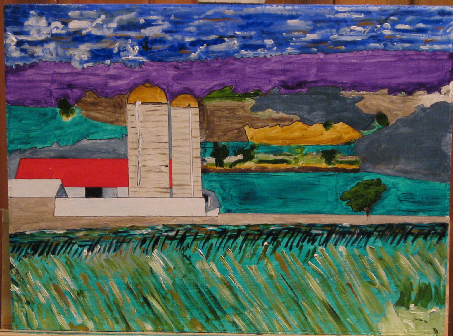
This is a short essay I sent to my parents and my older brother when I sent them prints (xerox copies) of my pencil sketches.

How to Enjoy Bad Art

As someone who creates and produces bad art – it’s important for me to make sure my audience understands the importance of proper viewing technique.

As I near the completion of a sketch – I get to the point where I look at it (even though it’s not quite finished) and evaluate the quality. I ask myself the question – is this any good? Or not?

Pretty much every time, my initial reaction is – this is terrible. I hate it. I am embarrassed to even consider the prospect of anyone else seeing this. It’s hard for me to keep from throwing the nearly completed drawing in the trash, much less to finish the project. Seriously.

One of the questions/issues/problems for a pencil sketch is knowing when to stop. I tend to stop fairly early which means my drawings tend to be (if anything) too light. I do not have the problem of too dark.

But somehow I manage to “finish” up, and I take another look to see if I like it any better. And the answer is “no”. It stinks.

This is what I do. I tape the sketch on my bedroom wall. Then I take 3 steps backward. As if by magic, the bad art becomes suddenly better. If I give it a few days, and view from different distances, angles, and lighting – my opinion gradually improves.

My suggestion to my viewers/audience is to tape the sketch directly to the wall at about eye level, roughly 6 feet high. It’s best to use drafting tape, but I’ve had good luck with masking tape.

It’s important to put the sketch somewhere with enough room to back up and view from a distance. The farther away you can get, the better the art is – so you may need to buy a bigger house.

Rembrandt himself, explicitly warned a client from viewing his painting from too close a range. Rothko (on the other hand) suggested 18 inches. What does that tell you? It says that my art is more like Rembrandt than Rothko. So I’ve got that going for me.